

Security
US insurance company Aflac reports customer data breach
Aflac says it quickly contained the incident, but it is still unclear how many people were affected.
-


Security
/ 2 weeks agoChinese hackers are targeting Canada telecom services
This kind of attack lets hackers monitor and potentially steal sensitive information without being detected.
-
How-To
/ 3 weeks agoHow to spot a fake social media profile before you get scammed
Arm yourself with the knowledge to identify fake profiles on social media and dating platforms. This isn't just a precaution—it's your...
-
Security
/ 4 weeks agoMillions of gadgets caught in Badbox 2.0’s sneaky web
Experts estimate that at least 1 million devices are actively infected.
-
Data Breach
/ 1 month agoHackers may have stolen your credentials again
All the sensitive data was on a poorly secured cloud server, completely open to the internet.
-
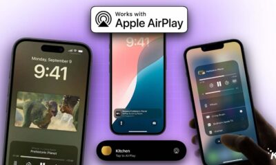
Apple
/ 2 months agoYour Apple devices are exposed to hackers until you install these updates
Apple's AirPlay is facing a storm with the "AirBorne" vulnerability, a hack that opens doors for hackers to access your data...
-
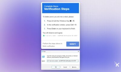
News
/ 4 months agoThis CAPTCHA scam tricks you into downloading malware
A new scam is making the rounds on the internet, where a CAPTCHA popup asks users to prove they're not a...
-
News
/ 4 months agoBillions of devices vulnerable to secret Bluetooth chip commands
This could potentially allow attackers to write directly to the chip's memory, spoof MAC addresses, and impersonate trusted devices.
-
Apple
/ 4 months agoApple removes Advanced Data Protection in the UK
This is in response to an allegedly secret order from the British government requiring a backdoor to circumvent Apple’s security and...
-
Security
/ 5 months agoHackers have a new favorite target: Password managers
Cyberattacks on password managers were three times more in 2024 compared to previous years.
-
Buying Guide
/ 5 months agoThe best VPN Service (2025)
Discover the top VPN services to secure your online presence against scams, viruses, and data theft. Protect your IP and personal...
-
News
/ 5 months agoThis new email scam bypasses 2FA and steals your identity
A new phishing kit called Astaroth, designed to compromise login credentials and 2FA codes, has been discovered, making it more dangerous...
-
VPN
/ 5 months agoGoogle Play Store shows verified badge on trusted VPN apps again
Google awarded the Verified badge to NordVPN, hide.me, and Aloha Browser.
-
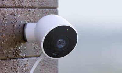
Buying Guide
/ 6 months agoThe best home security cameras (2025)
Security cameras are not just about keeping intruders at bay anymore. They're transforming home monitoring, from package protection to smart system...
-
Data Breach
/ 6 months agoAds in your favorite apps are giving hackers your location data
Ads on Tinder, Candy Crush, VPN services, and more are exposing your location data to hackers.
-
Apple
/ 6 months agoApple settles $95M lawsuit over Siri privacy concerns
The settlement allows users to receive up to $20 per Siri-enabled device they own.
-
Apps
/ 7 months agoQ&A: How session plans to outpace Signal and Telegram
Join us for an exclusive interview with Session's co-founder, Kee Jefferys. Explore how this app without phone numbers or central servers...
-
Apps
/ 7 months agoThis private messaging app doesn’t need your phone number or email
Session is a messaging app that offers privacy features such as no phone number requirement, no central server, and hidden IP...
-
Google
/ 7 months agoPixel Tablet finally gets VPN by Google on Android 15
VPN by Google was suddenly made available to the Pixel Tablet sometime in November. While Google has yet to update its...
-
Mobile
/ 9 months agoNSA in PSA for phone users: Did you try turning it off and on again?
NSA says a reboot should help keep your phone safer from hackers and malware.