Sponsored
3 types of retail graphics and how to use them
If you are wondering how you can use retail graphics to transform your business, there are plenty of ways you can do it using different types of graphics.
Just a heads up, if you buy something through our links, we may get a small share of the sale. It’s one of the ways we keep the lights on here. Click here for more.
Disclosure: This is a sponsored post. However, our opinions, reviews, and other editorial content are not influenced by the sponsorship and remain objective.
You should give your customers a shopping experience if you have a retail store.
Besides setting the right mood using lights, music, and strategically placing the products, you also should consider adding graphics to your strategy.
As when done right, retail graphics can significantly enhance your customers’ in-store experience.
If you are wondering how you can use retail graphics to transform your business, there are plenty of ways you can do it using different types of graphics. Some of the graphics you can use include:
Retail barricade graphics
Every retail store has partitions constructed for safety and security reasons when the store has a renovation or construction project. You can use these barricades to propel your business as a business owner.
All you need is to visit a reputable graphic-making company such as https://www.craftsmenind.com/ and discuss what you can have on the graphics.
The reality is you can have any message on the graphics. It all depends on your current needs. If you are introducing new products in your store, you can have an image of the product and a message detailing when the product will hit the stores.
Are you having a big promotion? You can let your customers know about this by having the information on the barricade graphic.
You can even make money by renting the space to brands. If a brand has approached you for advertising space in the past, you can rent them the pace before the renovation project is over.
The cool thing with a barricade graphic is that it not only passes your intended message, but it also comes in handy at improving the appearance of the barricade. Most barricades are dead and boring, and by adding a graphic, you improve the appearance of the barricade, making your store more attractive to your customers.
You should remember that while you will be using the graphics temporarily, have them made from high-quality material, and they are professionally installed to give a professional appeal.
Since you will be placing the graphics next to or outside a construction site, ensure they are created in accordance with the fire code requirements. This way, you are sure they won’t start a fire in the event sparks from the construction site fall on them.
Wayfinding retail graphics
Wayfinding graphics guide your customers around your store, making them feel at home and in control of the environment. As a business owner, you should know that when the customers can’t easily navigate around your store, four things can happen to them:
- They can become critical of your merchandise
- Spend less time in the store
- Fail to make a purchase
- Lower their loyalty
When you properly use the wayfinding graphics, you make the shopping experience easy and fun; hence, customers will likely come back.
There are plenty of wayfinding graphics you can use, with the most common ones being:
Overhead signage: These work if you have a large store such as a homeware store or supermarket. The purpose of the graphics here is to help the customers know where to begin.
For best results, place the overhead graphic in a prominent area where it can be easily seen from a distance.
Aisle graphics: You use aisle signage just like the overhead signage but on a smaller scale. For example, instead of saying “dairy,” as you would on overhead signage, you mention individual products such as milk, cheese, eggs, etc.
Freestanding signage: These are popular with large departmental stores with many products spread on more than one floor. For best results, use a combination of overhead signs, small aisle signs, and large posters and totems.
You should place the signs in highly visible areas that will capture the customer’s attention at the exact time they are looking for a direction to go. Ideal places to place the graphics include: foyers, escalators, and outside the lifts.
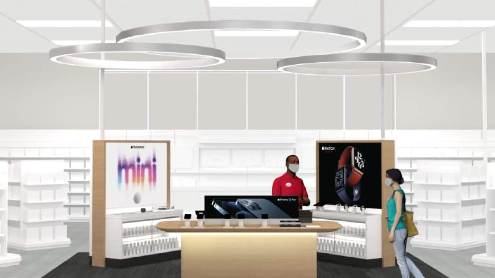
Large format graphics
If you feel that the small graphics aren’t giving your retail store the visibility it deserves, consider going big. And the good thing is there are plenty of large format options you can choose from. Some of these options include:
Repeat banners: Well done repeat banners give your store a sense of sophistication and class. All you need to do to create the banners is to print your business name or logo on a large graphic and place it in a strategic area of the store.
Wall graphic: Do you have an empty wall space in your store that you feel you should be taking advantage of? Consider filling it up with a stunning graphic. The graphic can be bearing any information you want.
Corporate mural walls: Corporates love to do it big, and you can copy their style and give your customers an out-of-this-world experience with giant murals. While these murals are great, you should note that they work best if you have a large store with large unused walls.
Stretch canvas: Do you have an impersonal wall that you would love to give a new life? A stretch canvas can help you achieve it. The beauty is you don’t have to be fancy about it. Take a simple photo and after stretching, place it on the dull wall.
Printing towers: If your store is large and has multiple product departments, you can use printing towers to market the various products under the department. While the towers can work in different businesses, they are a perfect match for those in the beauty, fashion, and technology industries.
Many people have reported awful experiences with large format graphics that often result from having too much information on them. So to get the most from the graphics, include as little information as possible.
Of major importance, pay close attention to the color palette. Keep the theme simple and use two or a maximum of three colors.
When it comes to the font, ensure it’s simple and easy to read. This calls for you to avoid script and serif fonts. You also should avoid bold fonts as they look overloaded, making your graphic unattractive.
An ideal graphic should have well-spaced fonts with clear gaps in between the words, and the color should contrast perfectly with the background.
Have any thoughts on this? Let us know down below in the comments or carry the discussion over to our Twitter or Facebook.
Editors’ Recommendations:
Disclosure: This is a sponsored post. However, our opinions, reviews, and other editorial content are not influenced by the sponsorship and remain objective.
Follow us on Flipboard, Google News, or Apple News