Development
Essentials of minimalist web design
Minimalist web design is so much more than taking away tons of stuff and leaving nothing but blank space. The key is in accentuating the content.

Just a heads up, if you buy something through our links, we may get a small share of the sale. It’s one of the ways we keep the lights on here. Click here for more.
In the last few years, the simplicity in web design has overshadowed the complexity. And the reason, also simple: people are tired of seeing too many information crammed in one place. If it’s done in the right way, minimalist web design can be truly beautiful and effective. Many websites that followed this kind of aesthetic prove that.
Minimalism is basically removing all the unnecessary elements in the design, making it clean and functional. Although the main principals sound easy, minimalist web design can actually be difficult to master. The same amount of usability must be provided with much fewer things to work with. In order to understand it, you must know the essentials of minimalist web design:
Flat interface
The trend of making the interface design flat has been going on for a few years. It seems that so-called flat design has become one of the main characteristics of minimalistic web design. In flat design, there are no shadows, highlights, gradients, textures or any three-dimensional elements.
No wonder that flat design and minimalistic design fit so well together- they both work on the same principle of removing anything unnecessary. Although these two trends seem to be the same thing, they are not. While flat design applies on the icons and graphics in an interface, minimalist design applies to a much bigger range of things in web design.
Limited use of color

In minimalist web design, the way color is used is extremely important. When you take into consideration there are not many elements, the color becomes crucial as it will grab more attention. Color can be used strategically to bring focus to a particular area or create some kind of visual interest.
In many minimalist designs, the color scheme is monochromatic, using white, gray and black shades. The combination of the monochromatic color pallet and one or two bold colors that will highlight the relevant elements is also often used in the minimalist design. It’s best to limit the color scheme to complementary colors, or the colors in the same family.
Subtracting the elements
One of the main ideas of minimalist design is to eliminate all the elements that don’t contribute anything to the functionality of the website. In this case, element refers to colors, fonts, images, links, menu items etc.
“Subtract until it breaks” is the philosophy of minimalism, and it means that unless the missing element isn’t crucial for the website content or functionality, it must go. Designers often fall into a trap led by the rules of minimalism and end up losing crucial content. It’s important that your website stays user-friendly and that it provides a great experience for your visitors.
Use of negative space

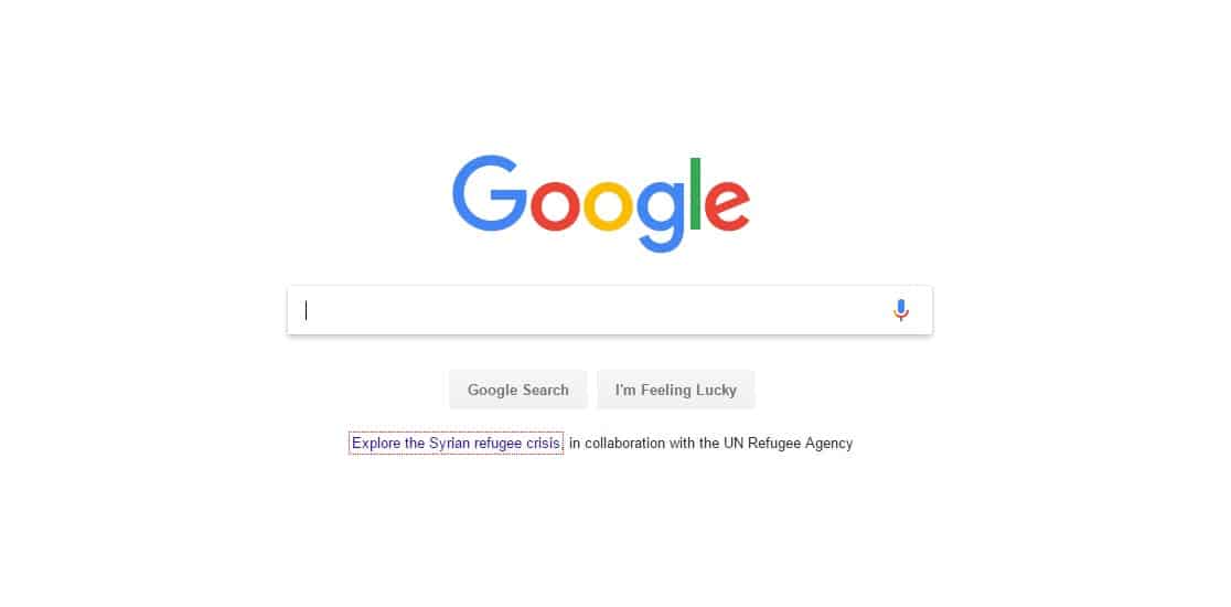
Negative (or white) space is considered to be the foundation of minimalist design, and one of the most powerful tools this type of design provides. It refers to the empty space of the web page after excluding all the unnecessary elements from the interface. Negative space can be filled with vibrant colors or it can be left in monochromatic tones.
White space is crucial when it comes to pointing out the particular elements in a minimalist design. The more white space there is around a certain element, the more attention it will grab. It is often used by high- end companies that strive for the exclusive look, and that is exactly what smart use of this principle achieves. White space largely contributes to the minimalist design, without it wouldn’t be what it is.
Dramatic typography
Since every minimalist design contains some words, the way typography is used is crucial for every minimalist site. Because there are not many elements in minimalism, a typeface can determine the atmosphere and the identity of the whole design. If used in a right manner, good typography can replace graphics and photos, and make a minimalist design more visually appealing.
When it comes to determining the hierarchy of the text, font sizes and variations in style and weight are vital. It’s important to know that bold typography should be used only when you want to deliver a significant message. There is a fine line between purposely bold typography and distracting typography.
Background photos

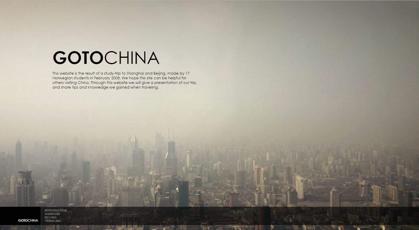
One of the latest trends in minimalist design is using large, high-quality photos (or videos) as a background. The hero headers and hero images are usually placed near the top of the page and often take the form of a slider. Although the image itself takes the whole screen and in theory, it doesn’t follow the principles of minimalism, it has become extremely popular in minimalist design.
The reason why it works so well is because it can create an effective look without too many details. Images should be used only if they have a purpose and help your visitors understand the site. The combination of quality background photo and typography can be great, as long as the text is readable. Large and appealing background images will get all the attention, so when combined with minimalist approach the user’s attention won’t be scattered.
Simple navigation
In minimalist web design, like everything else, the navigation should be as simple as possible. According to a well-known custom website design team, the most complex navigation that can be used is the drop-down menu, if possible without any submenus.
In most cases, the navigation is in a simple form of a top-level horizontal navigation and in some cases, a hamburger menu can be used. It is advised to use the hamburger menu only when it’s really appropriate because it can make the navigation items less discoverable. It’s important that visitors easily find the links they need, and perform all the activities with ease. So besides the aesthetics, be sure that the site is also functional.
In conclusion
Minimalist web design is so much more than taking away tons of stuff and leaving nothing but blank space. The core of minimalist philosophy is in accentuating the content. It’s about eliminating the distractions and to make people focus on what’s important. Conclusively, creating a minimal web design is all about finding balance, and finding ways to merge the message of the site with a simple design.


