Here’s what your favorite websites used to look like
Ever wonder what your favorite websites used to look like? This infographic tackles some of your favorite websites.
Just a heads up, if you buy something through our links, we may get a small share of the sale. It’s one of the ways we keep the lights on here. Click here for more.
There is no progress without evolution and complete transformation. Take websites as an example: do you remember all transformations Google and Yahoo went through? Probably not… simply because you got used to the changes really soon.
People may be nervous when they see a new version of a website they regularly visit, since they have to get used to the new outline and extra features. However, they still want developers to follow the trends and make innovations. That’s what technology is all about: moving the world forwards.
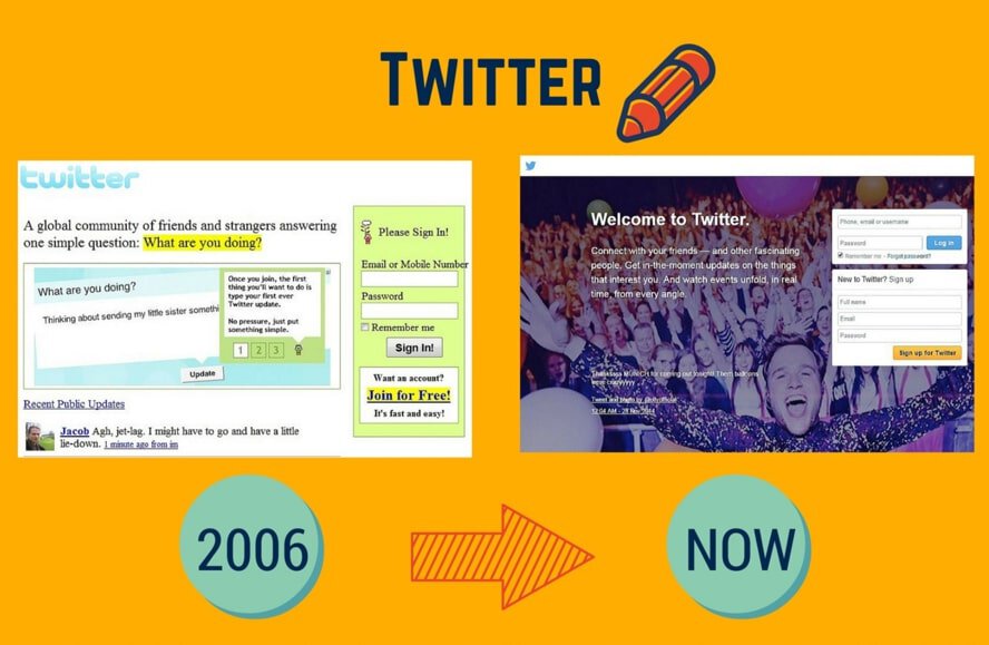
In this infographic developed by NinjaEssays.com, you’ll see comparisons of the first and latest versions of popular websites used to look like, such as Facebook, Apple, YouTube, LinkedIn, and more. Some of them have preserved the classic features, but others have been drastically changed. There is only one thing we know for sure: web developers must focus on progress for their sites to remain attractive in the chaotic online world.

Follow us on Flipboard, Google News, or Apple News


Review Roundups
Review roundup: Samsung Galaxy Z TriFold