Ads
Google changed how it displays search results and people are PISSED
Way to responsibly disclose sponsored results…

Just a heads up, if you buy something through our links, we may get a small share of the sale. It’s one of the ways we keep the lights on here. Click here for more.
If you’ve been wondering why your searches look a little weird on Google lately, you’re not alone. See, the search advertising giant has been fiddling with your feeds again, making it even harder to figure out if it’s a sponsored post or if it’s an organic search result.
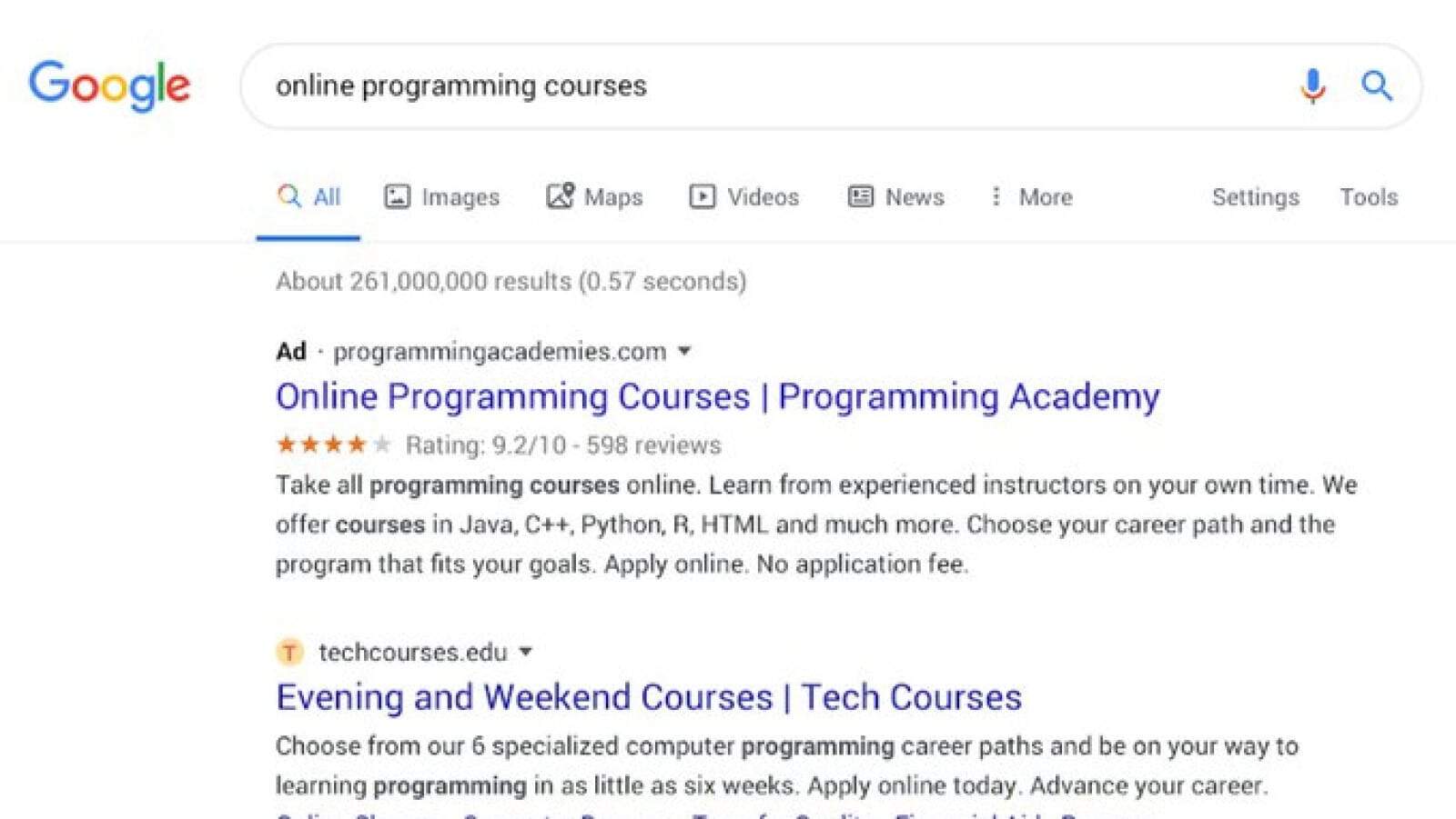
See, Google has to identify sponsored results, it’s the law. It seems that click-through wasn’t high enough with the prior format, as now all you have to show you’re clicking on an ad is a small Ad next to the URL. That’s it. With all the organic search results having favicons for the page in question, it’s even hard to tell if it’s an ad or not.
Google tweaked how it identifies sponsored ads in your search feed and everything is terrible again

Image: Google
Ok, Google. So you’ve got a captive audience to sell ads to. I mean, who uses the other search engines anymore? The thing is, you’ve got to play nice, which means clearly showing if results are organic search or paid placement. I mean, the top results on a search are supposed to be the most authoritative, not the ones that paid the most, right?
Your latest stunt is also against the 2013 FTC advise to search engine operators, which tells them to use “prominent shading with a clear outline, a prominent border separating the paid results from the natural results, or both prominent shading and a border. Furthermore, the text labels ‘ads’ or ‘sponsored results’ should appear at the top left corner of the ad block.” See any shading or borders? Nope, me either.
It seems that the original tweet is being ratioed, with people flocking to tell Google to change things back…
Awful redesign. Instead of clearly showing URLs of all search results in green large font you made them grey, small and obfuscated part of URL. So that makes it much harder to see where the URL leads. Time to look for addon to revert this or a different search engine altogether.
— Ilya Gorkavyi (@gorkavyi) January 17, 2020
Or to remind them that their motto used to be “Don’t be Evil” but now appears to be closer to “Don’t Appear to be Evil”
And… thou shall do your best to show the information your users are searching for, unless someone pays us and then we will serve up any tangentially related rubbish based on how much they have paid us, and in front of what you have specifically searched for.
— zerp4prez (@zerp4prez) January 22, 2020
And the existing issue of emoji spam to game the result rankings will just get worse…
When they changed the SERP with the favicon they thought of the emojis Many people are already using them to get attention. From a computer the look goes directly to those emojis. They should take action with this, otherwise there will be a lot of spam. pic.twitter.com/GYb20U6oXL
— Posonty® (@posonty) January 18, 2020
This user is now DuckDuckGone…
Yep. Switching to #DuckDuckGo This update is simply awful on desktop and mobile. I can’t find anything.
— Pho Get About It! (@phagettaboutit) January 20, 2020
Oh, at least some search results are very apropos…
Amazing UX on full-screen desktop. Love it, especially 600px column with actual relevant data. pic.twitter.com/R5n0UIUDEX
— Vasili Puchko (@VasiliPuchko) January 16, 2020
When you can’t tell if it’s an ad or a valid result, is there such a thing as organic search anymore?
https://twitter.com/alexhern/status/1220271858152550402?s=20
Oh, look… More users claiming deception. Is Megatron the new CEO of Google?
I think the old ads from way back when, when they were in the yellow box, were more better recognized as ads. This design is deceptive and not honest enough.
— Jeffrey Cammack (@spammack) January 16, 2020
Oh, and in case you thought the change was so brands could keep their favicon branding…
So ads don’t get to show their brand icon? Seems like an error of information modeling. Regular and paid search results should contain the same amount of information with ads visually identified as such.
— Sergii Shymko (@SergiiShymko) January 13, 2020
And that’s without the bugs… I mean if you’re going to focus on domain names first, they should at least display correctly
Note that there is a big bug with domain names, whose labels are sometimes swapped. Example here (should be www.gov.ca.gov): pic.twitter.com/sNc1Ohrp53
— Stéphane Bortzmeyer (@bortzmeyer) January 16, 2020
Oh, and in case you really still thought it was a user-focused change, Digiday has some stats showing click-through rates starting to climb on desktop since the change. More CTR, more profit for Google.
What do you think? Surprised by Google on this? Let us know down below in the comments or carry the discussion over to our Twitter or Facebook.
Editors’ Recommendations:
- Google wants you to know Apple’s Safari web browser isn’t as private as they say it is
- Google’s Envelope is not the cure-all to smartphone addiction, but neither is anything you’re doing
- Opera Touch is a new iOS browser that will finally get you to ditch Chrome and Safari
- A recent Chrome update is misplacing data from your Android apps


