Just a heads up, if you buy something through our links, we may get a small share of the sale. It’s one of the ways we keep the lights on here. Click here for more.
If you’ve ever found yourself on the Google News tab after a search, you probably have noticed that the information there can be a bit cluttered and jumbled. Now, Google is addressing that with a redesigned News feed.
First announced on Twitter, the redesign will be rolling out over the coming weeks.
Google’s News tab gets cards and more focus
https://twitter.com/GoogleNewsInit/status/1149379937142317056
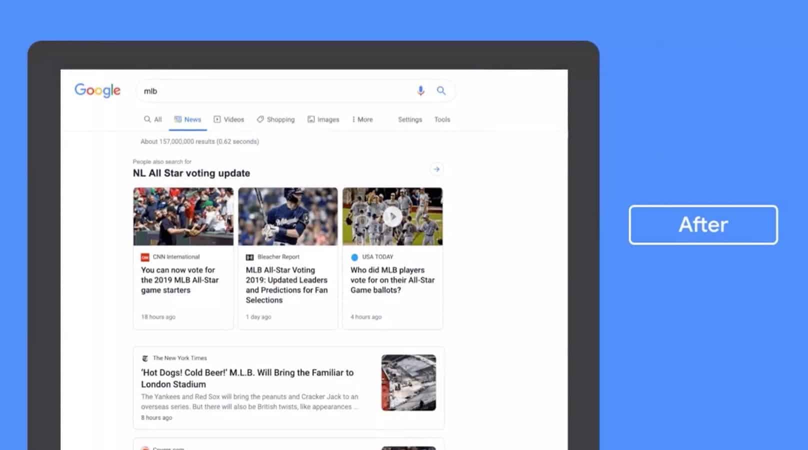
The new News tab will feature fewer links and now will feature ‘cards’ to help keep each article separate. It will put more of an emphasis on individual publications, and unlike before, where it would group news content together if it was relevant, each card will only feature one publication, an image, and some information regarding the topic.
Before

Image: Google
After

Image: Google
With fewer links being displayed per page, there definitely seems to be an emphasis on bigger outlets, but it will be interesting to see how it decides who and what to show when users use the new feature. Even so, the redesign looks like it will be a lot easier on the eyes, so the tradeoff is possibly worth it.
What do you think of the Google News redesign? Do you like it? Let us know down below in the comments or carry the discussion over to our Twitter or Facebook.
Editors’ Recommendations:
- One year later, the repeal of net neutrality is already f*cking us over
- Tweets that dehumanize religious groups will now be removed by Twitter
- A former Tesla employee is being sued for stealing Autopilot secrets and giving to a competitor
- Apple’s 2020 iPhone is reportedly getting a smaller notch and a seven-piece lens system


