Business
New design hacks are overcoming banner blindness

Just a heads up, if you buy something through our links, we may get a small share of the sale. It’s one of the ways we keep the lights on here. Click here for more.
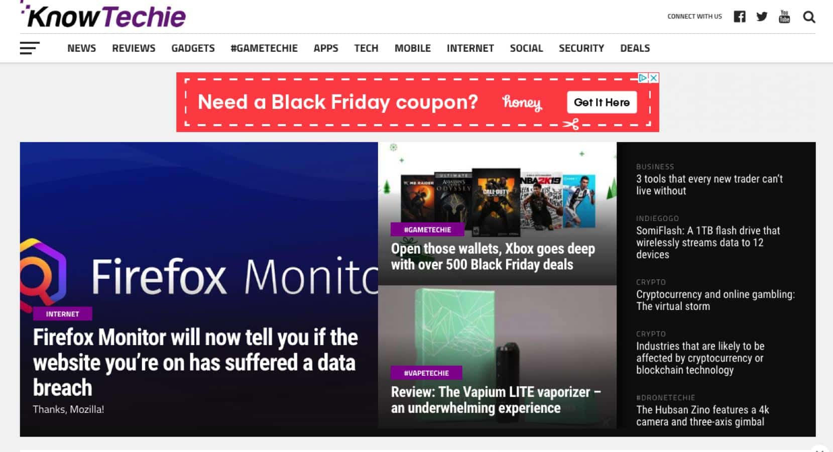
Banner advertisements used to be the default form of marketing in the early days of the Internet. However, they have since become much less effective. Banner blindness has significantly hurt the ROI of marketers that run traditional media buying campaigns.
The rise and fall of banner advertising
In the 1990s, banner ads were extremely popular. They were a novelty at a time and were far more visually appealing and engaging than the traditional print ads people were used to seeing. You can find a copy of the world’s first online banner ad here.
Unfortunately, the effectiveness of banner ads has plummeted in recent years. The average click-through rate of banner ads is only 0.1%. One study from InfoLinks found that 86% of customers suffer from banner blindness.
The biggest reason that banner ads aren’t as effective anymore is that people have simply grown tired of looking at them. They use a lot of annoying designs that are painful to look at. However, some banner ads perform considerably worse than others. They are usually designed with either really flashy or bland elements. Banner ads that actually work find more subtle ways to engage and inform their audience.
New design hacks make it easier to overcome banner blindness
Banner blindness has become more prevalent in recent years. However, it is not inevitable. There are some proven design hacks that will help you improve your CTR and conversion rate. Here are some strategies.
Use colors that contrast with the websites you will be promoting on
The biggest mistake that marketers make when creating media buying campaigns is seeing the websites they select and the banners they created as separate pieces of the puzzle. They believe that they can start by creating a high-quality banner and then focus on choosing a website to run their ads on.
You should begin by compiling a list of websites that you intend to test with your media buying strategy. You will need to design your banner ads around the design themes of your target websites. You will need to keep the following things in mind:
- You don’t want to use the exact same color scheme for your banners as the target website. If the background of the target website is light blue, then a light blue banner will blend in with the page. This will make more difficult for that banner stand out.
- The banner should still match the general theme of the site. If the website was designed with cool colors, then you will need to use other colors that still provide visual contrast. If the background of that site is light blue, then you might want to try using light green or very light magneto. Avoid using very warm colors in your banner advertisements if you are planning on running them on those sites.
Your banner advertising campaigns will be far more successful if you design your creatives around the theme of your target websites.
Test entirely different design themes before more subtle design elements
Many banner advertisers focus on making small design changes and see how they perform. They may try changing the color in the CTA of their banner or swap out one of the human subjects. Unfortunately, making a single change isn’t usually enough to make a poor performing banner work much better.
It is better to start by testing three or four radically different designs. The structure of the content, amount of text and types of visuals should all be different. After you have tested them, you can start testing different variations of your winning banner by making small design tweaks. Jeff Bullas says that it is a good idea to use banner design tools, because they have a number of different formats. Bannersnack is one of the best.
Follow an Organized Banner Hierarchy
You can’t incorporate visual elements randomly. You need to have an organized hierarchy. It usually follows this format:
- Your logo is at the top
- Your value proposition is beneath the logo
- The CTA is at the bottom
This isn’t just important for communicating your message clearly. It is also important to fight banner blindness. Your logo is the most unique element. If it is the first thing people see, it will help make it stand out. Your value proposition is also fairly distinct, so it should come next. The CTA is the least unique element of your banner, so it makes sense that it is the last thing people will see (although it must still be bold).
Use Gifs Instead of Flashing Banners
Flashing banners used to work well. They are now practically useless. People tune them out because they add too much noise to their browsing experience.
You can still use dynamic designs to make it stand out. The trick is to use rotating images that add value to your banner. These can be rotating images of your subjects or subjects.
Have any thoughts on this? Let us know down below in the comments or carry the discussion over to our Twitter or Facebook.
Editors’ Recommendations:
- Facebook adds more gun advertising restrictions on site
- The state of Washington is suing Facebook and Google over political advertising
- The state of Washington is suing Facebook and Google over political advertising


