News
Twitter’s revamped iPad app is basically the web version
Can they just integrate Tweetdeck already?
Just a heads up, if you buy something through our links, we may get a small share of the sale. It’s one of the ways we keep the lights on here. Click here for more.
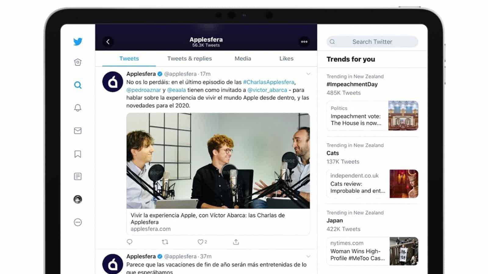
Twitter has changed its iPad app to use more of the extra screen space, as first reported by Applesfera. The redesign cuts down on white space, with a triple-column layout with your feed sandwiched between a navigation bar and Twitter’s trending topics.
While this might be a welcome step in the right direction, it appears that the new interface is really similar to the web version. Yay, I guess?
Finally, Twitter is revamping its iPad app

Image: Applesfera
Okay, don’t get too excited here. It seems that Twitter has just cloned the desktop experience into their iPad app. That means the same three, uncustomizable columns as the web interface. C’mon Twitter, you own Tweetdeck, why can’t we have customizable columns so we can read what we want without you pushing Trending topics down our throats? Oh wait, maybe that’s why…
It seems that the rollout to iPad is happening in stages, with Twitter users using the iPad Twitter app to complain about the iPad Twitter app, in what’s surely too meta4me. Lovely.
If you want to see what the layout looks like, open Twitter in a desktop browser. There, enjoy the iPad Twitter experience, without owning an iPad. Your bank account will thank you.
What do you think? Glad to see this layout coming to Twitter? Let us know down below in the comments or carry the discussion over to our Twitter or Facebook.
Editors’ Recommendations:
- A group of trolls targeted Twitter users with epilepsy with a barrage of strobing images
- Twitter now lets you upload iOS Live Photos as GIFs – Here’s how
- Spotify is testing Tastebuds, a feature that helps you discover your friends’ favorite music
- Photoshop for iPad sounds like a complete mess – here’s what folks are saying about it
Follow us on Flipboard, Google News, or Apple News