
Internet
Sans Forgetica is a new font that can reportedly improve your memory
Sans Forgeticabout’ it.
Just a heads up, if you buy something through our links, we may get a small share of the sale. It’s one of the ways we keep the lights on here. Click here for more.
Do you ever find yourself often re-reading something twice? Do Powerpoint presentations put you to sleep? Australian designers and behavioral scientists at RMIT University have introduced a new font it hopes will make text easier to remember.
Called “Sans Forgetica,” (yes, that’s the name) the font is more difficult to read than most typefaces, and that’s by design. Because the font is legible but also broken and disconnected, it forces your brain to work harder. In doing so, you’ll retain more information.
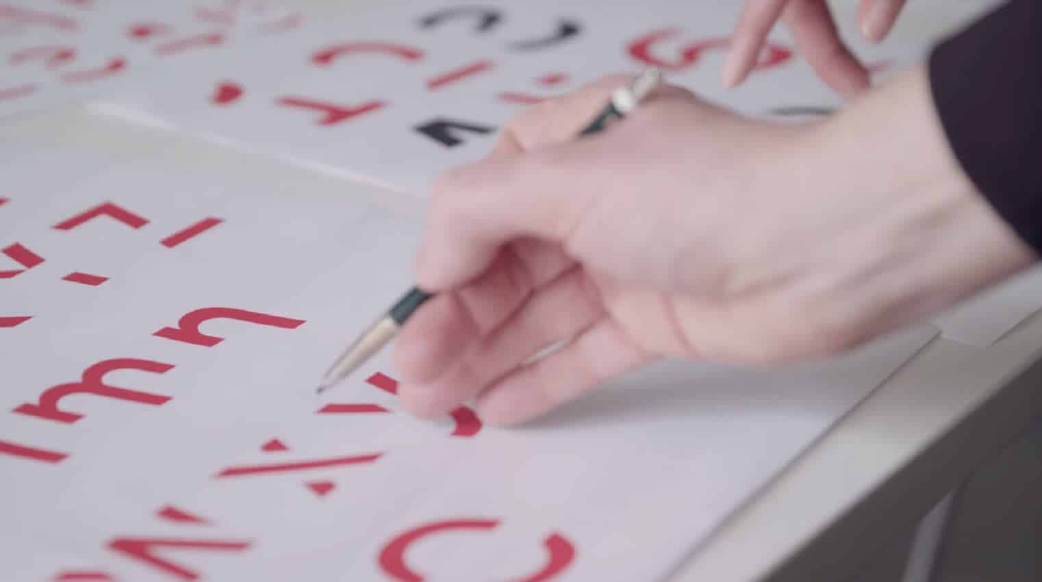
Here’s what it looks like:

Can you read this?
“The mind will naturally seek to complete those shapes and so by doing that it slows the reading and triggers memory,” according to Stephen Banham in an interview with The Guardian, a co-creator of Sans Forgetica.
A study involving 400 university students showed that 57 percent of respondents remembered what they read when the words were written in Sans Forgetica. This is compared to 50 percent who saw the same works written in plain Arial.
Despite this, Banham says he doesn’t want to see his creation everywhere. “God no, you wouldn’t want novels printed in it, it would probably induce a headache,” he told The Guardian.
You too can download and use San Forgetica. It’s free to download as a font and Chrome browser extension online.
Personally, I find Sans Forgetica headache-inducing. Still, perhaps that’s a good thing. That headache might be my brain adding more data!
What do you think? Let us know below.
Editor’s Recommendations:
- Apple will brick your iMac Pro or MacBook Pro if you try to repair it yourself
- Leaked footage of Amazon’s New World game shows survival and magic elements
- Netflix is hogging up a whopping 15% of the world’s internet traffic
Follow us on Flipboard, Google News, or Apple News