Amazon
Amazon changed its new app icon to make it look less like Hitler
Amazon was quick to separate itself from this blunder.
Just a heads up, if you buy something through our links, we may get a small share of the sale. It’s one of the ways we keep the lights on here. Click here for more.
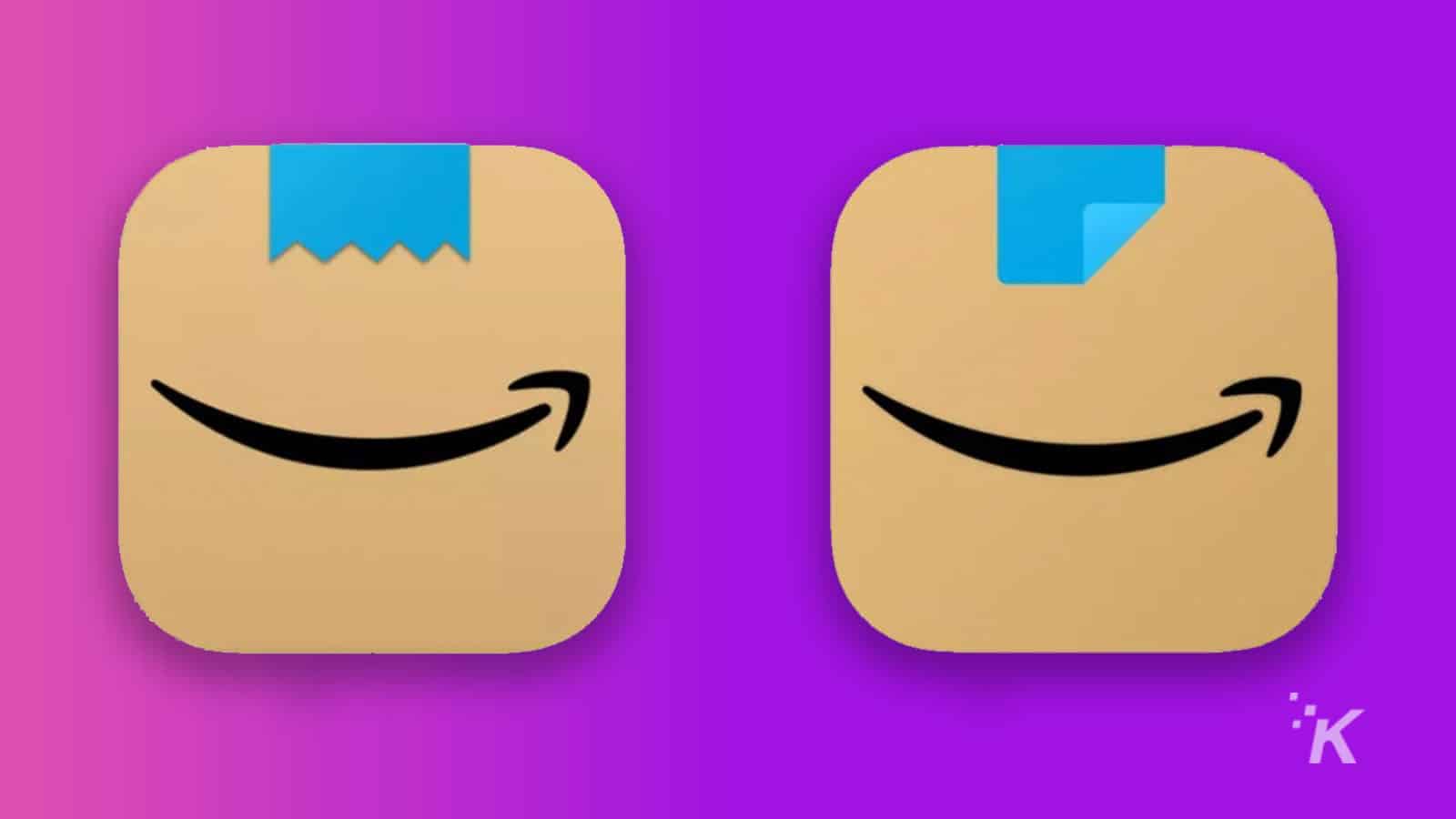
Amazon has quietly made some subtle changes to their new app icon. The new icon was initially released in January. It immediately received negative feedback from users saying that the original icon resembled Hitler’s mustache.
The new icon was introduced to resemble Amazon’s trademark packaging, as opposed to the all too familiar logo set on a white background. However, user’s quickly began to notice a resemblance to the Nazi dictator.
Though there was no big announcement for this update, the Today Show reported that the change came to iPhone on February 22nd and a week later to Android devices.
The new Amazon logo is definitely less Hitler-like
The jagged design of what is supposed to be tape at the top of the original logo is what makes this icon resemble the Nazi dictator. The “toothbrush” style mustache was actually popularized in the early 1900s, mostly by silent film comedian Charlie Chaplin.
However, the style definitely became associated with Hitler after the psychopath’s rise to power in Nazi Germany in the 1940s. That certainly explains why Amazon wants to keep the logo as far away from this comparison as possible.
The updated design comes with a two-tone, folded piece of tape over the edge of the cardboard box. This is seemingly to recreate the excitement of peeling of the tape on a recently received order. Of course, the design still contains the well-known swooping arrow that we’ve come to associate with Amazon.
According to the Today Show article mentioned above, an Amazon spokesperson mentioned nothing about the icon’s Hitler comparisons when asked about the update, but the ecommerce giant definitely updated the icon for a reason. Fortunately, Amazon was able to quickly catch this issue and update the icon. Hopefully, the company will be able to recover from this mistake. Somehow, I think they’ll be okay.
Have any thoughts on this? Let us know down below in the comments or carry the discussion over to our Twitter or Facebook.
Editors’ Recommendations:
- People are illegally selling portions of the Amazon rainforest on Facebook Marketplace
- Luna, the cloud gaming service from Amazon, is now available on Fire TV devices without an invite
- Walmart will no longer require a $35 minimum order for its two-hour delivery service
- For the first time in nearly a year, all US Apple Stores are open


