Just a heads up, if you buy something through our links, we may get a small share of the sale. It’s one of the ways we keep the lights on here. Click here for more.
The importance of fonts is often understated. While some people view fonts as an art form all its own, most of us take them for granted with a few notable exceptions.
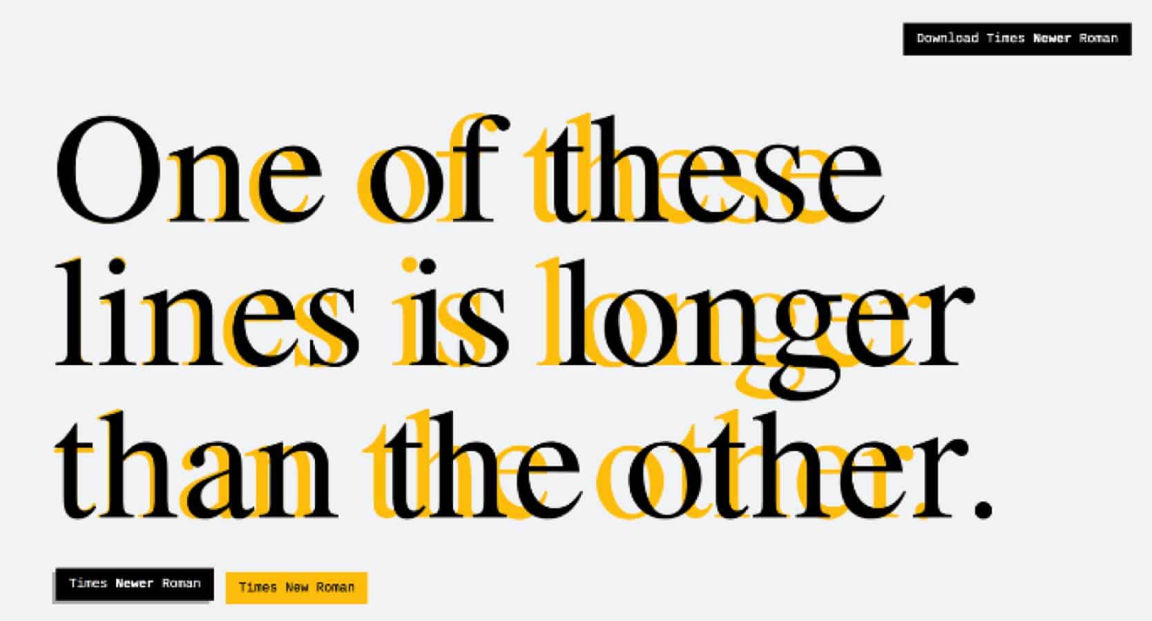
Besides never ever using Comic Sans on anything outside of an invitation to a children’s birthday, the world of academia places a huge importance on fonts as they relate to page requirements. Times New Roman has long been the standard, the frustrations of which has led to the creation of Times Newer Roman, a font that adds some much-needed depth to the classic font of yore.
Times Newer Roman is a real font, created off the back of open-source font Nimbus Roman No.9 L, a font that mimics the look and feel of Times New Roman. Times Newer Roman makes its mark by extending the font, widening the letters and spaces between letters, without messing with the vertical height in order to maintain the same word count but filling the pages at a quicker pace.
If you require a bit more on the technical spec side of this font, the Times Newer Roman website explains:
The x–height of all lowercase letters has been increased by about 5% so that they sit wider at the same point size. Certain letters that can be widened easily, like the “n”, “u”, “v”, “y”, among others, have been edited manually. The size of punctuation has been increased by 15% across the board and the spaces around them increased proportionally.
Is there really even a difference?
Times Newer Roman was created by subversive marketing firm MSCHF, also responsible for Dos Toros’ Burrito Time app and the near-useless but amusing Couch Potato app. The new font, previously in beta, has already met with mixed reviews from academia and students alike.
“I thought I had great eyes, but I really cannot tell the difference,” said an anonymous 11th-grade high school teacher who apparently couldn’t tell the difference.
“I am not a fan,” said an anonymous professor at NYU who apparently could tell the difference and was slightly miffed at the cheap way to advance page count without advancing word count.
Yet, this professor seems to be one of the sharp ones so far as on NYU student tells us that “I have been using this font for some time now, on multiple papers and assignments and so far, my professors cannot tell the difference”.
Hooray for fonts!
You can download Times Newer Roman through this direct Zip download link.
Editors Recommendations:
- Did a Samsung Galaxy Note 9 just burst into flames? One woman claims hers did
- SpaceX’s first private passenger will be Japanese billionaire Yusaku Maezawa
- Elon Musk is being sued by the Thai cave rescuer he dared to sue him