Just a heads up, if you buy something through our links, we may get a small share of the sale. It’s one of the ways we keep the lights on here. Click here for more.
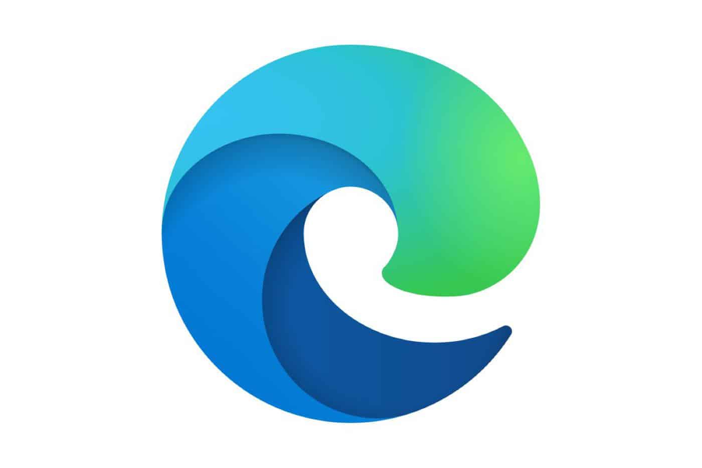
So Microsoft unveiled a new Microsoft Edge browser logo over the weekend and I’m a bit confused. First off, WTF exactly is this? Also, why did Microsoft feel the need to change it? Why is this news? Ugh, I have so many questions.
What exactly are we looking at here? Obviously we can see the letter “e” here in this logo, but look at it, it’s soooo thicc. That is by far the thickest letter “E” I have ever seen. And are we not going to mention how this clearly looks like a blatant ripoff of Mozilla’s Firefox logo?
New Microsoft Edge Logo looks a lot like Firefox, inverted and rotated 180°. Well done, designers. pic.twitter.com/gEkmw1g0ol
— T❘LM△N (@Tilman) November 2, 2019
Before we go any further, let’s see how we got here. Thankfully, Tom Warren of The Verge crafted this tweet that shows the subtle changes Microsoft has made over the years. Notice how drastically different the last one is.
Microsoft's new Edge logo is the most significant change to its browser logo in more than 20 years https://t.co/Tp01KD6MKP pic.twitter.com/PBS2KaufNL
— Tom Warren (@tomwarren) November 3, 2019
So yea, not sure what Microsoft as trying to get at here, but hey, it’s new and I guess that’s cool. Personally I’m not a fan of it, but I can sleep better at night knowing I’m not the only one. Gizmodo thinks the logo looks NSFW, The Verge says it looks more modern, and Mashable thinks it looks like a Tide pod.
What do other folks have to say about it? It’s a mixed bag, but overall people seem to dig it:
https://twitter.com/JenMsft/status/1191357293268537345
Already, people have said the new Edge logo looks exactly like logos from Firefox, Chrome, and Opera. I'm pretty sure a logo can't look exactly like three logos at once. People are looking for something that isn't there. Great job with the new browser, @MicrosoftEdge team! pic.twitter.com/hYPWFuJcv7
— Conner Paulson (@ctpaulson) November 2, 2019
I like the new edge logo. pic.twitter.com/Ub176MxKfi
— ALASKANJACKSON (@ALASKANJACKSON) November 3, 2019
Cool new logo’s for the new Edge browser and Office. pic.twitter.com/Ls1r5iUY3g
— Maurits Knoppert (@MKnoppert) November 4, 2019
Loving the new Edge, TidePod logo and all. Bing + Edge = Binge?
— mikegil (@mikegil) November 4, 2019
I like the new logo for the Edge rewrite. It’s visually different from the pst while looking new/ modern. https://t.co/KGkGHacoVI
— Kyle Korndoerfer (@KyKoSoft) November 4, 2019
We have to admit though, this logo legit looks like a Tide pod:
New Edge browser logo or tide pod? You decide.
Also, Firefox called, wants its designer back. pic.twitter.com/3tF2F5EC7a
— rUv (@rUv) November 3, 2019
And we are calling it…Microsoft TidePods!
here's the new Microsoft Edge logo: https://t.co/NpyW2ni8FS pic.twitter.com/leVjxk3nml
— mehedi (@mehedih_) November 2, 2019
The new Edge logo is just bland. If it's supposed to be a wave then why not rename the browser to Surf?
— Jox (@johanalkstal) November 4, 2019
Regardless if you like it or not, Microsoft’s new Edge logo is here to stay. As to when the new version of its Chromium Edge browser is going to release? We’re still waiting to hear but seeing that we’re getting a look at its new logo, our guess is that we’ll see it sooner than later.
Have any thoughts on this? Let us know down below in the comments or carry the discussion over to our Twitter or Facebook.
Editors’ Recommendations:
- Thanks to Gizmodo, I am now convinced Amazon’s logo is a penis
- Microsoft may have leaked Project Scorpio’s logo
- OMG Facebook has a new logo and we have a story
- Samsung hints at upcoming news of its foldable phone with subtle logo change


